This Blog is Blinding You Less
May 09, 2010 3:48 AM by Daniel Chambers (last modified on May 09, 2010 3:54 AM)
I’m a software developer (a professional one now! I graduated in April), not a designer, so when I’d finished designing the site I was surprised at how good it did look. However, it came as little surprise that apparently the site was causing Rob Conery’s cones to beat his rods, and therefore it should be burned alive. When receiving such brusque criticism, one may wish to send back an equally abrupt response, however in this case the criticism was justified, and therefore instead of starting a flame war I considered the criticism on its merits (and I’m sure Rob meant his comments humorously). Rob also took the time to write a post on his blog detailing his grievances and making some suggestions.
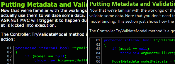
It turned out that half of his problem was caused by him viewing the site on a Mac that didn’t have the font I use for the text on this site (Segoe UI). I had assumed most people would have Segoe UI by now, as it is packaged with Vista, 7, Office 2007, Leopard (and I assume Snow Leopard too). However, upon further investigation it seems that very few people have it installed (around 50% on PC, and probably less on Mac). This is what Rob saw, versus what I saw in my browser on Windows 7:

What Rob Conery saw (left) versus what I saw (right)
Looking at the differences there, I really can’t say I blame him for hating the site. However, even with the correct font there’s still a few readability epic fails in there, in particular the blue text on the black background. That code styling had been the styling I'd liked and worked in in my IDE for over five years, so I guess I was used to it and didn’t notice.
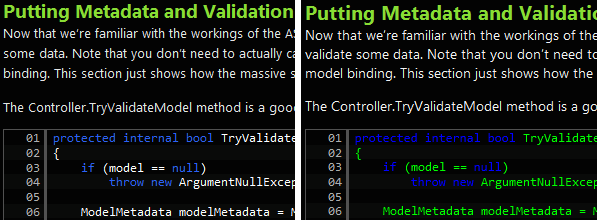
I did some reading about typography and layout, however, I didn’t particularly want to replace my CSS with a Blueprint base, as it’d make me redo a lot of tedious annoying CSS work. I figured I could pretty easily fix the main pain points with the readability of the site by making some small key changes. I read that for high contrast colour schemes like the one used on this site, one needs to use a bigger line spacing than normal. I also read about good fonts to roll back to when clients are missing the main one. In addition, I found a new code colour scheme that I liked, an adaptation of one made by my friend Dwain Bunker. Here is the result of my changes:

The new site style (left) versus the old site style (right)
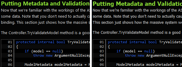
As you can see, I’ve shrunk the font size slightly and increased the line height. The font size had to be shrunk since I was using a font size that works in Segoe UI but was not well supported by the fonts I rolled back to (hence the travesty that Rob had to see). I’m now using a font size that all fonts seem to be able to deal with. The main font is also a slightly darker shade than it was previously. I’ve also changed the code style significantly. Gone is the blue on black, to a more purple-blue colour that is easier to read. The lime green has been replaced with white. (I’ve also started using this style in my IDE). However, we still need to see what happens when the user doesn’t have Segoe UI installed (other than Dogbert bazookaing your old XP computer (upgrade to Windows 7 now, damnit!), or a Terminator terminating your Mac):

The new site style (left) versus the new font rollback site style (right)
As you can see, there’s very little difference between the normal font (Segoe UI) and the rollback font (Tahoma). I still think the normal font (Segoe UI) is much better; it has better kerning and slightly wider letters. If you don’t have Tahoma (old Macs may not have it), I roll back further to Geneva (a Mac font), which is apparently similar to Tahoma.
Hopefully, these changes have addressed the main pain points with the readability of this site. Of course, some people may just plain dislike high contrast colour schemes, but you can’t please everybody.
Comments (3)
Submit Comment | Comments RSS Feed
Troy Cox
May 09, 2010 11:26 PM
Dude, this site is almost un-readable to me--And I use a dark background in VS all day. I would love to read it, if you would tone the contrast. It looks like you would have some good stuff. This actually hurts within a minute.
:(
I can't say I have the same issue (and my friends (my testers!) seem to agree with me, so I know I'm not alone on the issue).
I did crank the brightness of the text back a bit, but do you still find it too bright? Maybe I need to look at it on some different monitors...
Maybe try a lighter background for the site. I personally dislike it as well :(.
I use a dark theme in Notepad++, but the background isn't black, it's blue. Looks a LOT better than a black background IMO: http://ss.dan.cx/2010/05/01-01.31.07.png
